


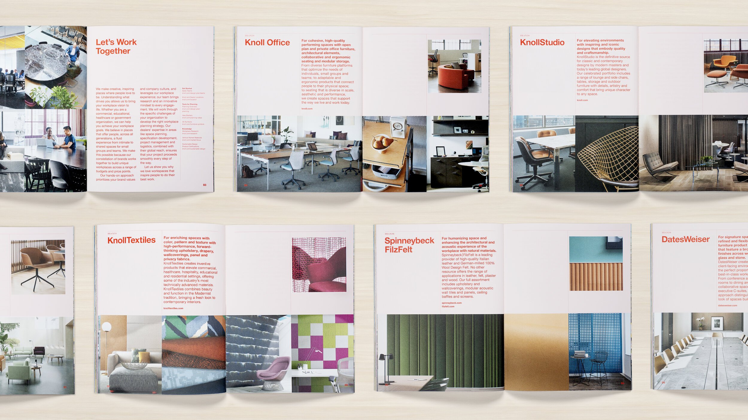

Knoll wanted to launch an annual publication that lands somewhere between magazine, book and catalog. The content was part client collaborations, part. company milestones and additional designer profiles. We wanted to showcase the breadth of Knoll’s expertise for the modern workplace.
The design brings Knoll’s color palette to life and embraces modernist typography. We aimed to make this typographic system to feel more expressive and dynamic: each story has a custom color palette, type treatment and layout logic, combined with a very clear structure to give readers a unique physical and visual experience.
I was hired by Gretel NY as editorial designer and art director for this project.